Redesigning how facilities see, and fix, their hardware remotely.
Project Citrix LMS
Category SaaS, Global Workforce
Sole contributor. UX, UI
Contributors Head of Technical Products, Enablement Training Leadership
01
Challenges
Nine thousand global employees needed one learning experience. They had four or five.
Citrix's existing learning experience fed training and product updates to a global sales team of roughly 10,000 employees — a team responsible for educating major clients including the Department of Defense, eBay, PayPal, Samsung, and Red Bull. The business requirement was broad: reimagine the "learning experience" from top to bottom and turn it into a true enterprise-level LMS.
Context & Constraints
Two experiences had to be redesigned at once — without breaking the reporting behind either. This meant tackling the redesign from two directions at once — the front-end experience for the salespeople consuming content, and the administrative experience for the teams creating and managing it. Any redesign also had to preserve the existing data streams that business orgs relied on for reporting and metrics, ruling out a clean-slate rebuild in favor of something that could refactor around what already worked.
02
Research & Discovery
Before redesigning anything, we validated what was actually broken.
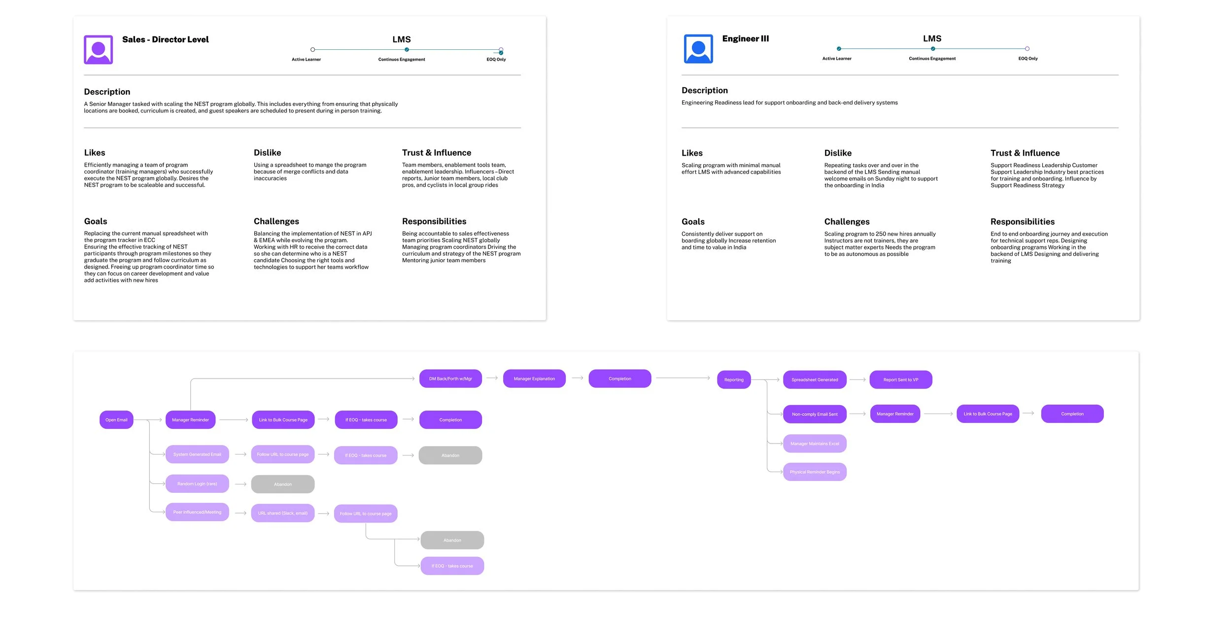
Working alongside our Principal Product Owner, Director of Enablement Technologies, and Lead UX Researcher, I started with validation and background research on the existing design and methodology — including a competitive analysis and a heuristic evaluation to pressure-test the current UX systems.
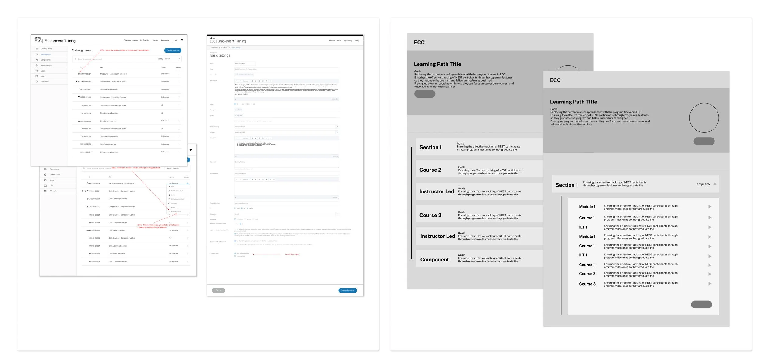
From there, we ran a full research cycle with the global sales force and their managers: interviews, usage research, and validation testing to understand how the learning experience was actually being used day to day. That fed into card sorting, sketching, wireframing, and collaborative whiteboarding sessions with users and stakeholders.
03
The Approach
Four or five sites became one — and the org chart followed.
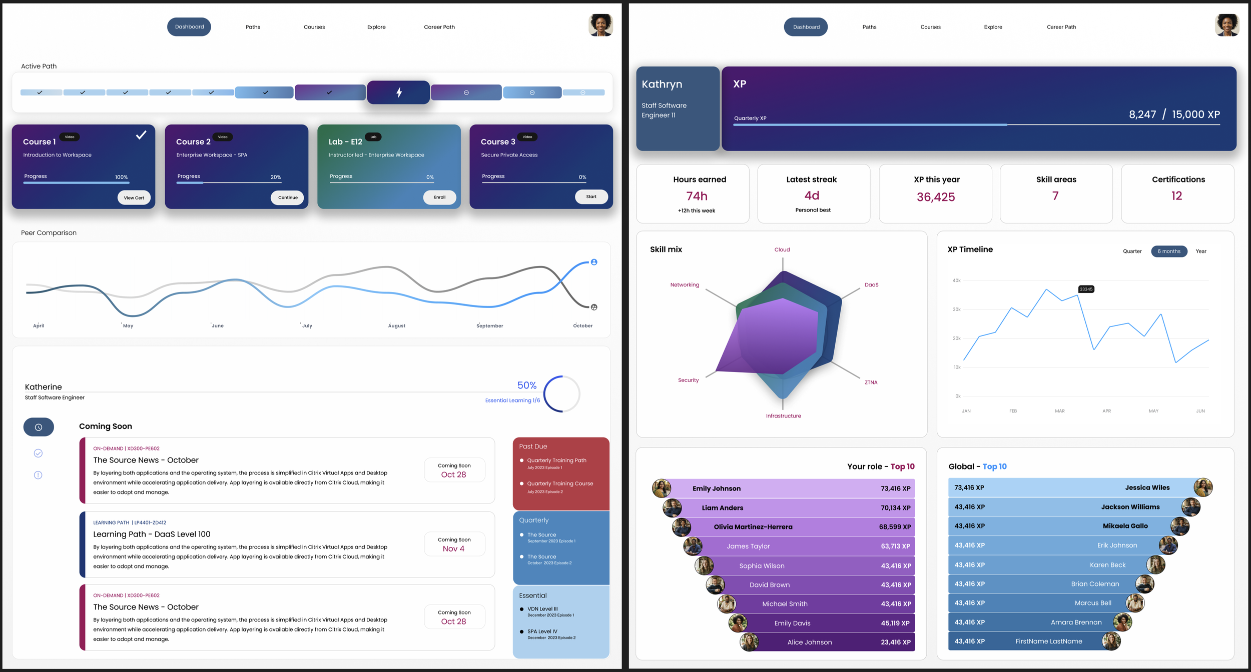
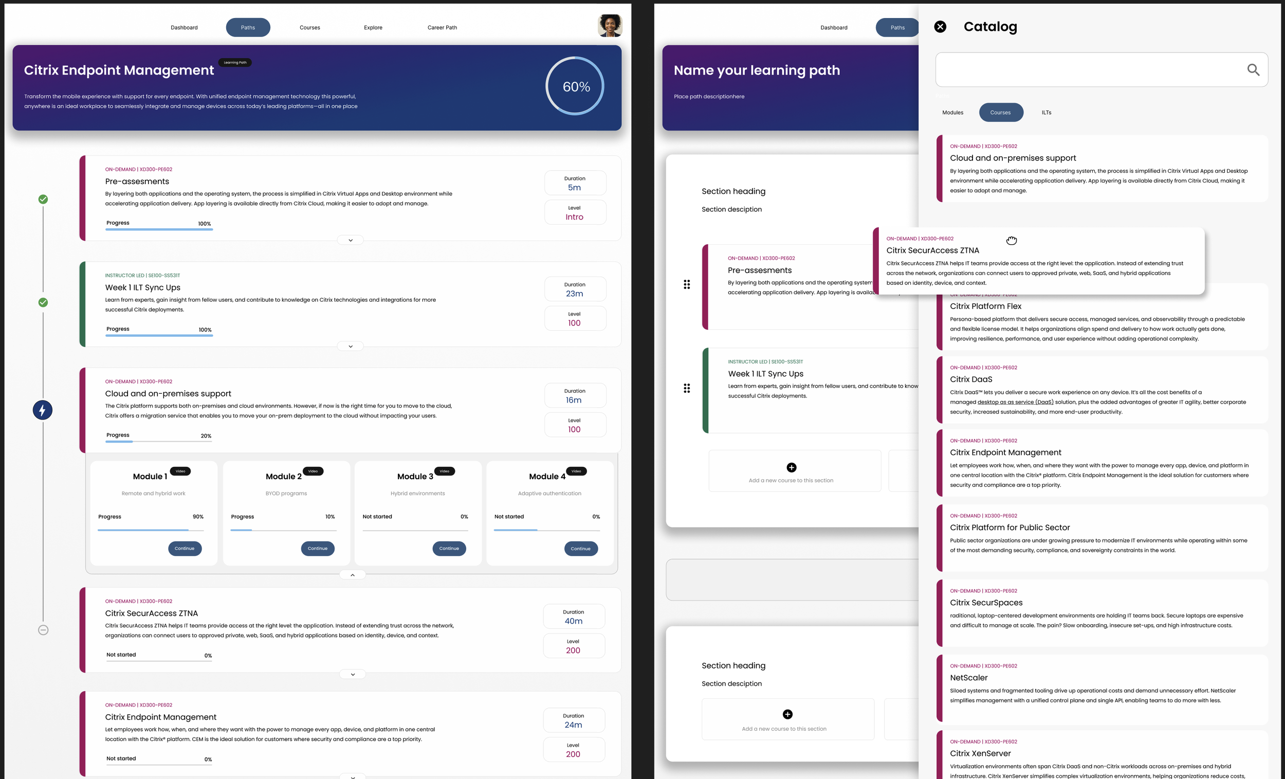
After weeks of whiteboarding and wireframe reviews with stakeholders, we landed on a design that let us refactor much of the existing architecture while pairing it with an entirely new interface and experience model. Where four to five separate sites had previously served the same learning function, we consolidated everything into one platform with a unified backend.
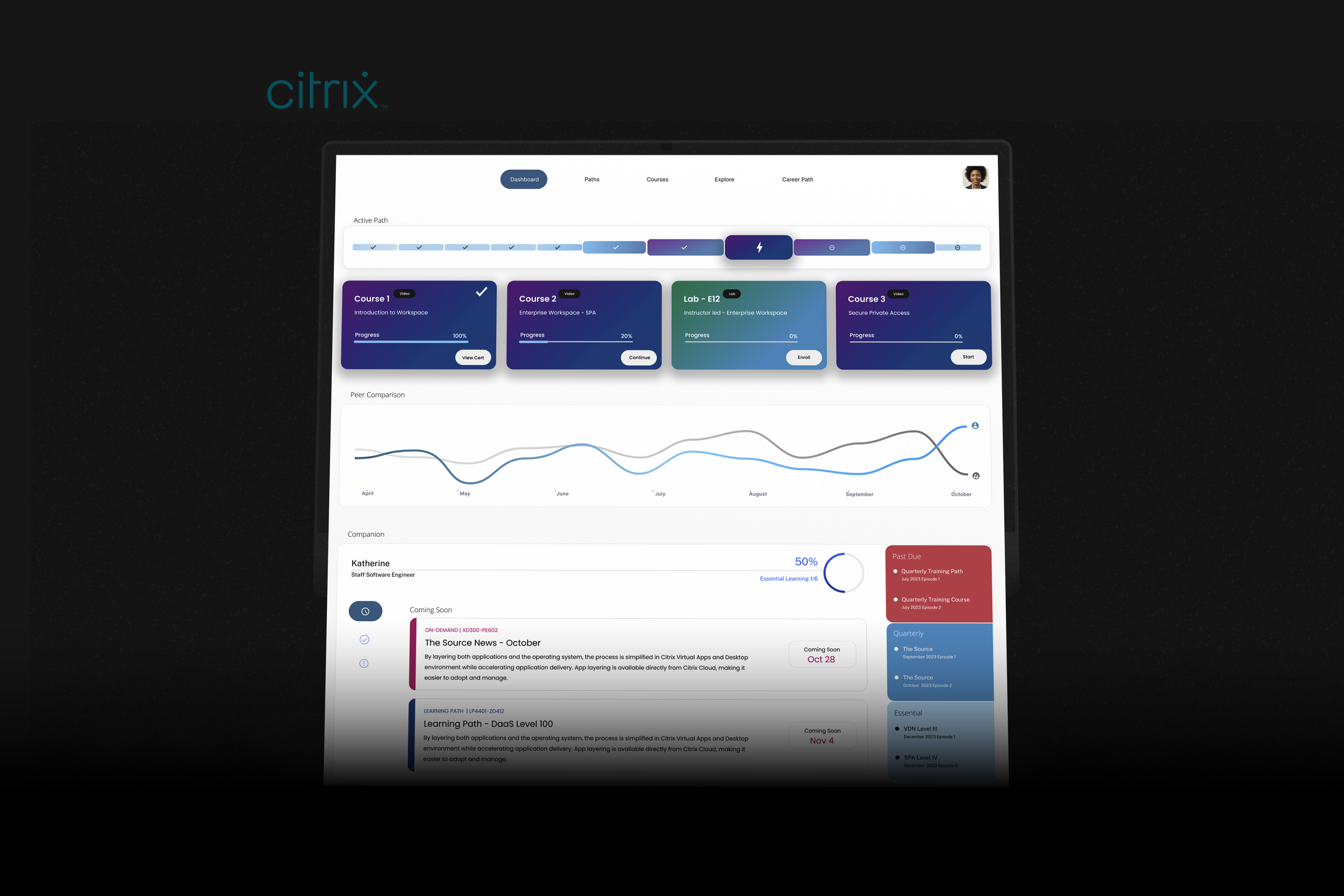
\Disparate teams and business units, previously working in silos, converged around a single goal — and the UX team stitched every experience into one interface. The result was "Learning Path": a single UI where users could see and track their own progress across all learning content, with most manual administrative processes eliminated from the content workflow entirely.
03
Iterating Beyond the MVP
Our own success became the next problem to solve.
Success created its own problem. Once Learning Path launched and adoption grew, learning path creators began building increasingly expansive paths — and users started experiencing cognitive overload navigating them.
We ran periodic user testing on the MVP to track this as it emerged, then moved into a second iteration focused specifically on simplifying the experience: identifying which content and actions users actually needed, and removing or hiding what wasn't earning its place. The goal shifted from "help people find everything" to "help people find the right thing" — a natural evolution once the underlying consolidation work had already succeeded.