CASE STUDY
Citrix LMS
Reinvent the existing sales enablement platform by bringing engineering and UX together to build a next generation learning experience
Overview
Business Problem 1
The existing Citrix learning experience existed to feed training programs to the global sales team. The user-base is a global team of roughly 10,000 employees that need consistent and constant product updates to further educate themselves and Citrix clients. Client examples include the Department of Defense, eBay, PayPal, Samsung & Red Bull. The business requirement was broad in scope and focused on all possible ways to improve the “learning experience” from top to bottom and turn this into an enterprise level LMS platform.
We needed to approach this redesign both from the front-end user experience and the administrative experience of content creation.
Design Solution
Myself, our Principal Product Owner, Director of Enablement Technologies and our Lead UX Researcher began doing validation and background on the existing design and methodology. We did a deep dive into competitive analysis, I ran a Heuristic Evaluation to validate the existing UX systems, and we ran classic UX best practices to begin the project. We interviewed, researched, validated and tested how our global salesforce (and their managers) used and consumed the content of this “learning experience”. We then ran a classic process of card sorting, sketching, wireframing & Miro whiteboarding with users and stakeholders.
Where We Landed
After weeks of whiteboarding and reviewing wireframes with stakeholders, preserving the existing data streams business orgs need for reporting & metrics, and testing, we landed on a design. This design also allowed for us to refactor some of the existing architecture while keeping it coupled to an entirely new user interface and experience model.
Main takeaway – user engagement went up by over 42%. Additionally our business teams were thrilled to see a drastic decline in their teams behavior of waiting until the last moment of each quarter to take their training. They were engaged sooner and more frequently with our new approach.
Participants
President, Sales Enablement
VP, Sales Enablement
Director, Enablement Technologies
Lead Systems Architect
Lead Product Designer
(me)
Principal Product Manager
Engineers
Front-End Developers
UX Process
UX Research | Heuristic Evaluation | Card Sorting | Whiteboarding | Sketching | Wireframing
Personas
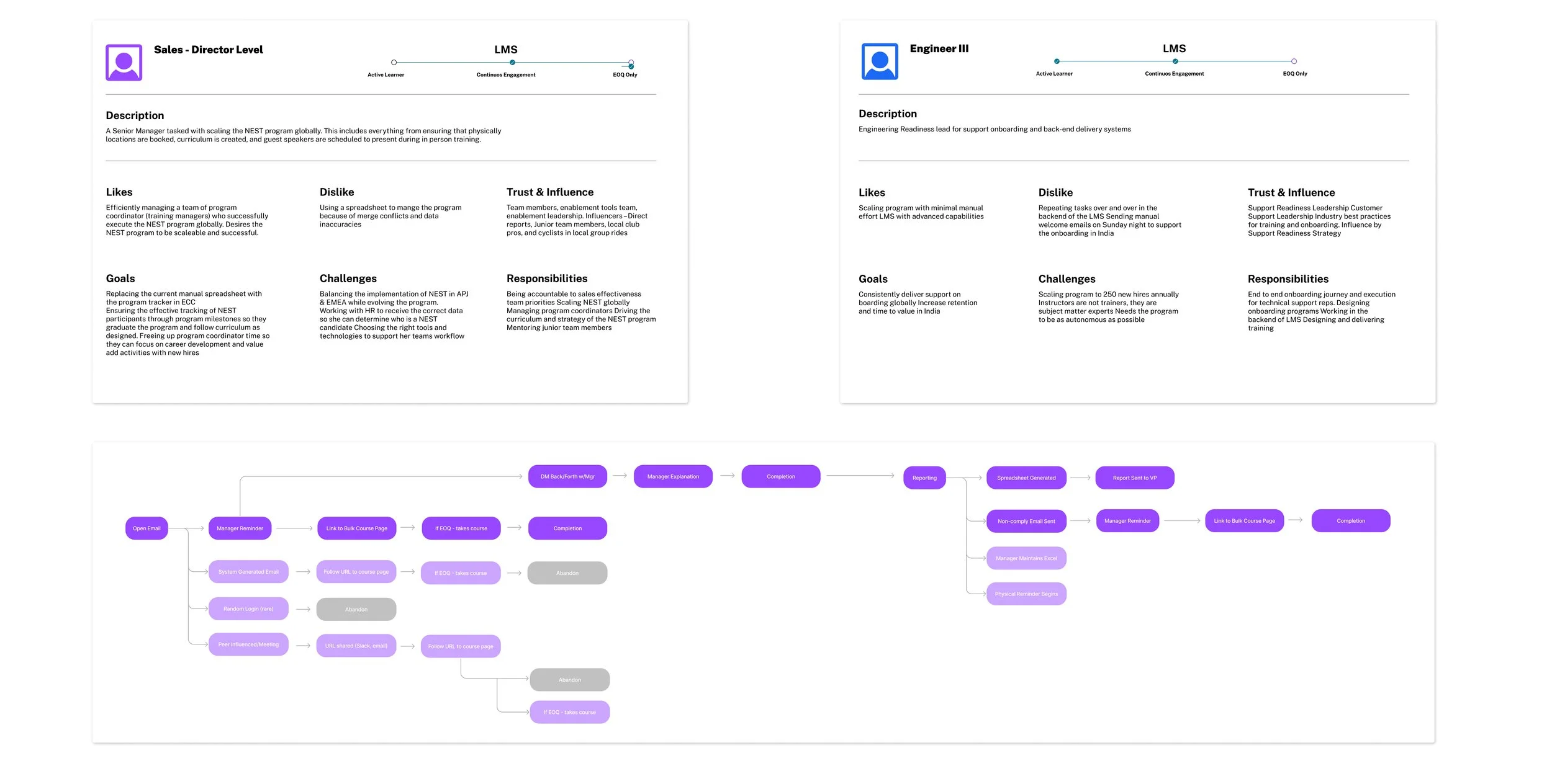
Previous iterations of the existing learning experience had never gone through a UX process. Assumptions had been made year over year about who the user base was, but we felt a need to run an exercise of getting to know both our internal users and our external client users. By creating the personas below, we arrived with around 7 user types from primarily 2 different organizational groups, Sales and Engineering. We then needed to identify existing pain points within that system, what they expected to see in a new product based on best-in-class LMS platforms competitive analysis, and needed to understand their session-based user journey.
User Journey
As mentioned, the user personas helped us evaluate who our users were and how they behaved. The user journey exercise was invaluable in identifying how arduous it was for our users to complete their training and how that content was delivered. We then ran a series of small focus groups to review user journeys based on the new design concept in wireframe form. The outcome of this was that the new design was going to allow them to do their job faster and also keep them engaged more.
Card Sorting
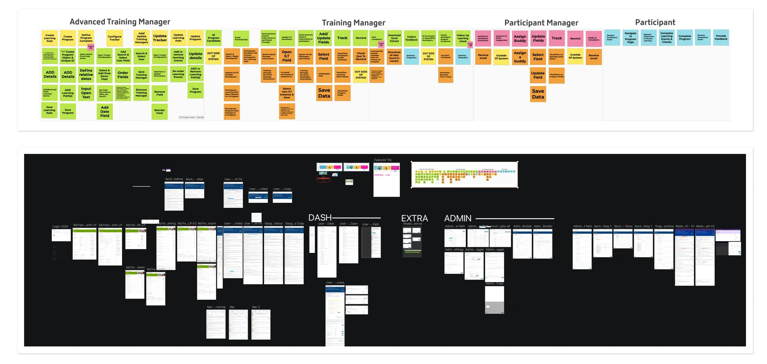
In addition to the “user” experience being handled on the front end, we also needed to give as much attention to the “admin” experience, so we ran a Card Sorting exercise with the 4 main content creators to understand how they created content, their best/worst practices and the tools they used. This is where we clearly identified the disparate sources of content, what 3rd party apps were assisting them, and how much flexibility we had with our existing tech stack.
Miro Whiteboarding
Prior to FigJam, we used Miro for our whiteboarding sessions once we moved away from our 1 day workshop of actual whiteboarding. I transposed all the physical boards to Miro boards in order take advantage of the collaboration tools it has. We had teams and individuals in the Americas, Europe and Asia all collaborating on this project so gathering information in a centralized location was key to our success.
Wireframing
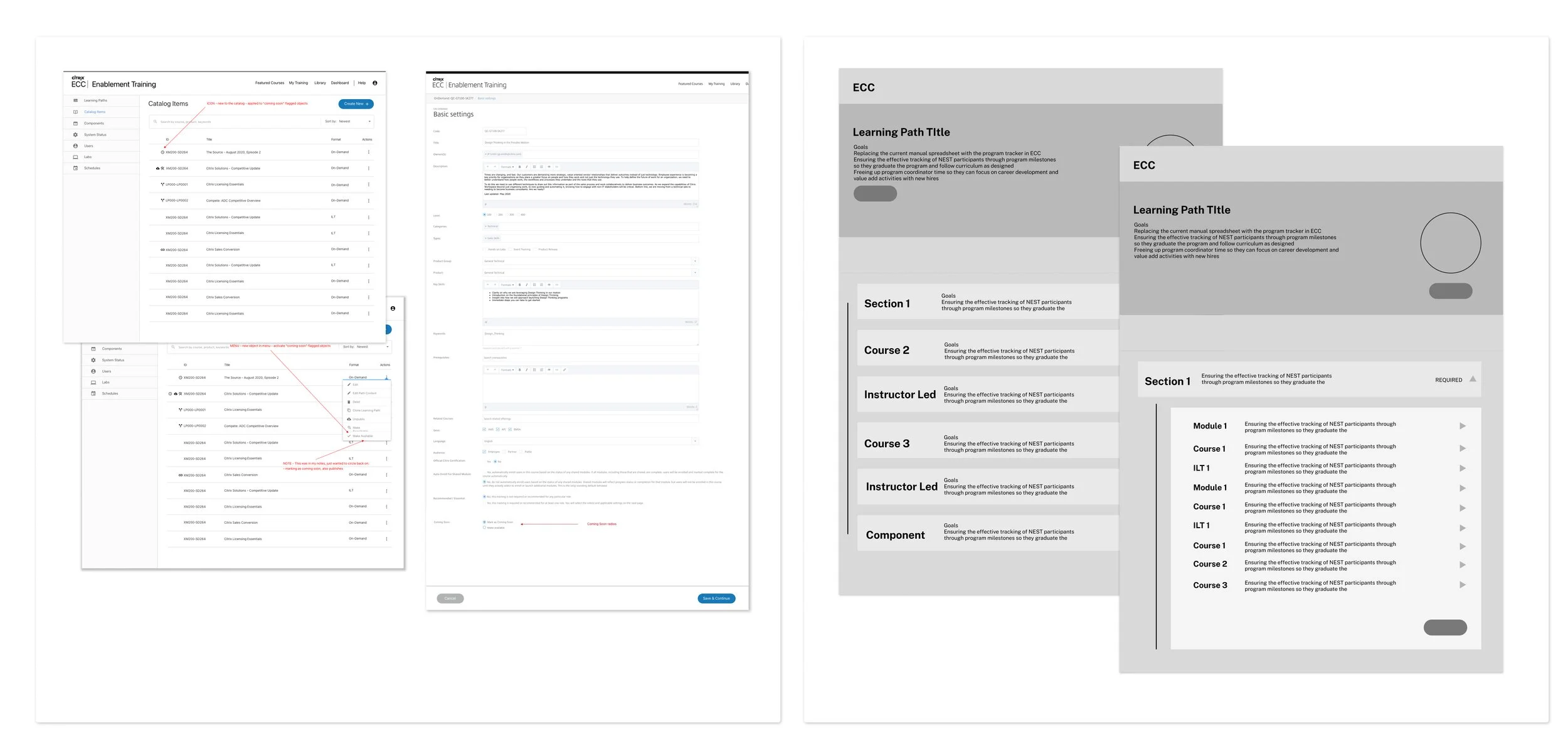
The wireframes for this project can be seen below. We ran 3 sets of wireframes to surface everything we needed early in the process. What we ended up wire framing were a series of screens to visualize the complex amount of data we were handling, then a 2nd series to organize that data into refactored admin UIs, and finally a series to focus on the front-end user and admin experiences.
Final Design
User Experience
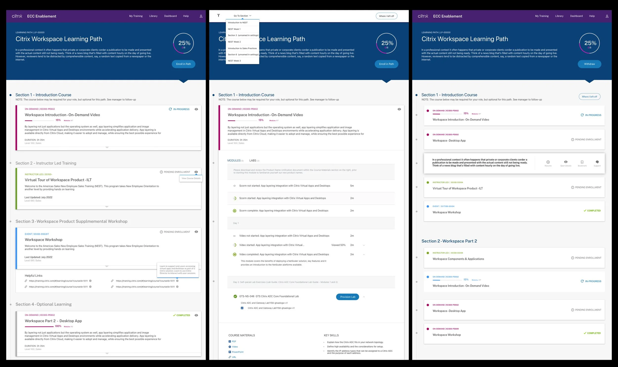
The result – Most of the manual processes were eliminated from the entire UI and from the typical user workflow as it related to administering content. Where there were four to five unique sites all serving the same learning management, we streamlined it back down to one and combined the backend systems as a unified group. Disparate teams and business organization worked together towards this common goal and the UX team connected all the experiences into one interface.
Our final product became the “Learning Path” design and our vision for the global LMS. We identified and refactored back-end issues that may have had an impact on the front-end user experience. We placed all sources of learning content into one UI that users could visualize their progress and consume. Lastly we ran periodic user testing on the MVP (first 2 images below) until we were in a position to begin the iteration process. For example, with the popularity of this new tool, learning path creators were creating very expansive paths that caused a cognitive overload for many users. Our first iteration would be to help rectify this positive side effect of the redesign.
Below you will see our next iteration of the users experience design. We identified content and actions our users felt were needed and which could be removed or hidden. Users were far more efficient based on our organization of the UI, now we just needed to simplify the experience for them.
Final Design
Admin Experience
Throughout this case study, the end user experience was the real driving factor and primary business goal. However we did instantly realize that we were introducing a brand new experience model that needed to be maintained, created and curated by our administrative users on the back-end. They were going to need a brand new UI in order to reduce their workload and also make user adoption of our learning paths much easier for the user. Our users were getting a great new experience, our admins needed a similar experience to support this.
A preexisting obstacle was that there were a small number of admins with permissions to build content or to create programs for other users or stakeholders. This was a major logistical hurdle as teams had to wait idly as a small number of admins would create very simple pages of learning content and timelines were far too often disrupted by this. We set out to expand this admin user group and quickly identified with Card Sorting how they were delivering their requirements to the small team of creators. We were now enabling them to work around this process and create Learning Paths by themselves, so a very simple and user friendly UI was needed to support this new population of administrators.
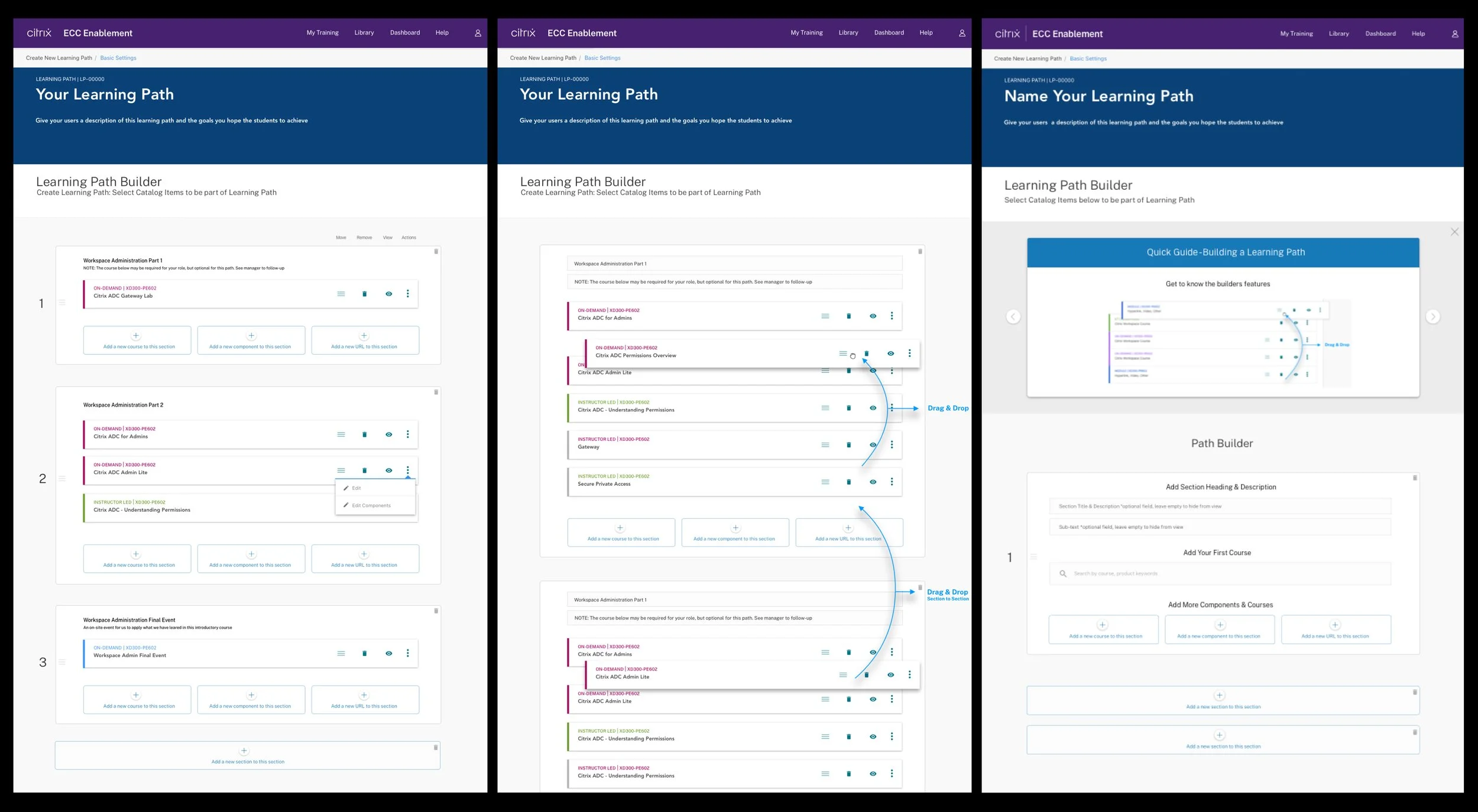
Below you will see our MVP for the admin experience. This UI allowed straightforward and minimal learning path creation for both advanced users and for new users who might need some onboarding. Very much inline with industry standards for site builders or other web apps, we allowed for fast retrieval of content from a centralized library and used features like drag and drop and quick previewing to see how the learning path looked to the user. This experience was the final business goal we needed to meet, and has become the core tool across the entirety of the Citrix organization after launching with only 2 internal groups for the MVP.