CASE STUDY
American Express
Two business problems. One UX solution solved them both.

Overview
Business Problem 1
Annually American Express business goals were to reduce cost and time agents spent on calls with potential card holders. Feedback and data indicated that users were not able to gain meaningful information from the AMEX websites that would help them decide on a card that was right for them and their spending habits., Or they struggled with chat or calls with agents to learn more. We were tasked with solving these issues.
Business Problem 2
American Express wanted a premium experience for any new online experiences that were inline with their major rebrand. In addition to bringing all these experience up to brand standards, AMEX expressed a desire for us to stretch our data science capabilities with targeted design based on specific data sets. Our proprietary models could customize content and delivery unique experiences per customer, now we wanted to see how visual design could be utilized to fuel the data science created.
Design Solution 1
Myself and our Lead UX Researcher spent multiple days listening to call center engagements and identified that time reduction could be resolved by surfacing content that gave the user faster information on spending habits, what membership rewards appealed to them, and how they benefit from card membership. Existing designs were not handling these issues in a meaningful way. These were buried in long-form marketing content farther down the page, a side effect of branding guidelines .
Design Solution 2
Targeted design - This was an opportunity to get engineering and design working together to stretch our current customization models beyond traditional content. Fresh new branding in addition to a new customization model allowed us the ability to create multiple experiences based on same card, but with a completely fresh set of designs and content tailored to a set of users.
Where We Landed
Use the rebrand as a catch-all for these 2 challenges by working with Data Scientists, Engineers, Marketing Analysts, and Product Owners to develop a customization platform (proprietary) that educated potential card holders early in their online experience (pre-sales call) while also targeting them directly through imagery, design, and content that might feel more authentic to them as individuals or as business owners. This preserved the essence of the rebrand and design system, while incorporating our technology to work in the background.
We combined new rebranding assets like photography, styling, and content and merged it with our new architecture and experience-delivery tech stack. It was my responsibility to map these designs, and the multitude of iterations it would require to target each audience or user with a customized experience.
Participants
American Express Team
Director, Global Sales
VP, Sales Enablement
Senior Business Analysts
Marketing Team, Card Membership
Our Team
Design Director
(me)
Director, Marketing

Director, Engineering
Director, Data Science
Senior Engineer
UI/UX Engineers
Research & Development
Identify Needs
All the participants above met to identify business needs for a global brand. My role was to orchestrate this from a UX design standpoint and drive the merger of the design of a global brand with our tech stack.
Sketching/Whiteboarding
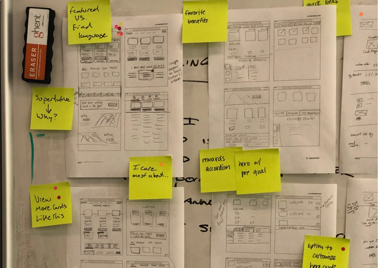
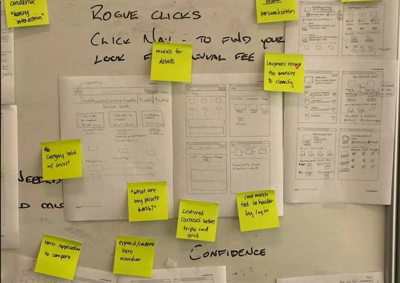
Post-workshop week, we gathered all sketches (including sketches from non-designer business teams) and we would be begin iterating, again and again. Followed by formal whiteboarding and eventual low fidelity prototyping.
Card Sorting
Early in the process we utilized remote collaboration (Miro) to surface any business requirements and user needs. For example, where was the energy? What did stakeholders need financially? What did users need experientially?
UX Research
Our Lead UX Researcher and I began both short-term and longterm research. We partnered with stakeholders, business leadership and used moderated and unmoderated user testing.
Journey Mapping
Journey Mapping uncovered a multitude of opportunities in terms of simplification and targeted user direction. Previous iterations proved overly complex, when the simplified version proved both informative and led to higher conversion.
Business Reviews & Data Science
Periodic all-hands meetings were a staple to our ongoing evaluation of data and user feedback. This is where our testing results reached significance and we were able to deep-dive into successes and failures.
UX Workshops
In the case of the above business challenges it was decided to have both my team and the AMEX team on-site for formal UX workshops which I hosted and moderated quarterly over 5 years. Design Thinking, Card Sorting, Whiteboarding, Mapping, and other UX best practices were our guides.
UX Process
2 Day Workshop - Design Thinking | Card Sorting | Whiteboarding | Sketching | Wireframing
Day 1 - Business teams and creatives opened with discussions on goals and expectations in terms of both design and business needs.
Our team came prepared with our findings from standard analytics to identify baseline information (clicks, abandons, response, etc). Also during that time we had implemented Fullstory and had a collection of videos and documents that summarized user pain points and why we thought response was low. A big take away was cognitive fatigue, the users were having to read long content blocks to understand 2 or 3 basic concepts, such as rewards they get with a card and which card was right for them.
We also had agents come to Day 1 activities to reinforce our findings that small business cards and consumer cards had users with similar motivations, which was previously not considered because these were siloed groups within AMEX. Each group had independent marketing motivations and objectives. Our thinking, small business card inquiries still began with an individual, just as a consumer. They wanted to see the card, see 3 reasons why they needed it, and what they got back from their AMEX membership versus AMEX competitors.
Wireframe 1 - AMEX Rebrand Model - American Express team wanted to run this test in UserZoom alongside our proposal on the right. The rebrand continued along the lines of existing marketing and heavily branded heroes with video backgrounds, emphasis on photography, and very little content unless the user had to deep-dive through multiple pages. This was the “premium” design concept they felt their users needed and wanted, however their performance was down on all metrics we analyzed.
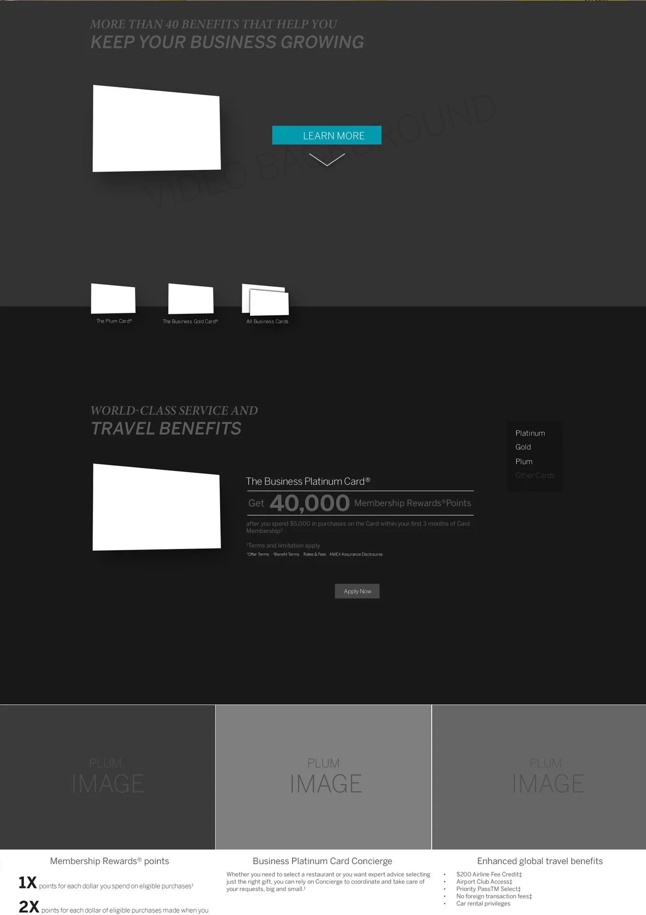
Testing & Validation - The wireframe above is based on a strict adherence to the AMEX marketing team's rebrand guidelines. It only had success with large capitalization companies and affluent consumers, not the millions of everyday users and small businesses, so roughly ~70% of users felt the need to abandon and felt the need to speak with an agent or get a chat experience that tilted them in the direction of high yielding cards for AMEX. They loved the design, but it ultimately did not meet their needs.
Day 2 - We began the card sorting and whiteboarding early in the process and aligned on the following ideas to begin iterating on.
Brevity in content, at least initially, was needed for the user to quickly decide if the card they were viewing had what they needed. Examples like: “This card is great for business travel”, and here are 3 bullet points to tell you why. Example: “Lounge Access at major international airports”.
Secondly (as can be seen below), a 3 card layout in the hero was going to be our primary design. Most agent calls ended up with 2 contenders, with a 3rd sometimes being the final choice. We decided surfacing the most popular 3 cards, along with the users individual diversity towards card member rewards and benefits was optimal. Data later supported this was the correct assumption with greater engagement site wide, faster calls and online approvals, and cost reduction.
Wireframe 2 - Our Model - With the left image, a user would be presented with the premium design AMEX was known for, but with our solution, we consolidated content, exposed and simplified major selling points and found a way to expose this into a highly functional hero with a 3 card layout or a tabbed system (seen below). We also injected a wizard with qualifying questions to help users identify their behavior and we matched a card to that behavior.
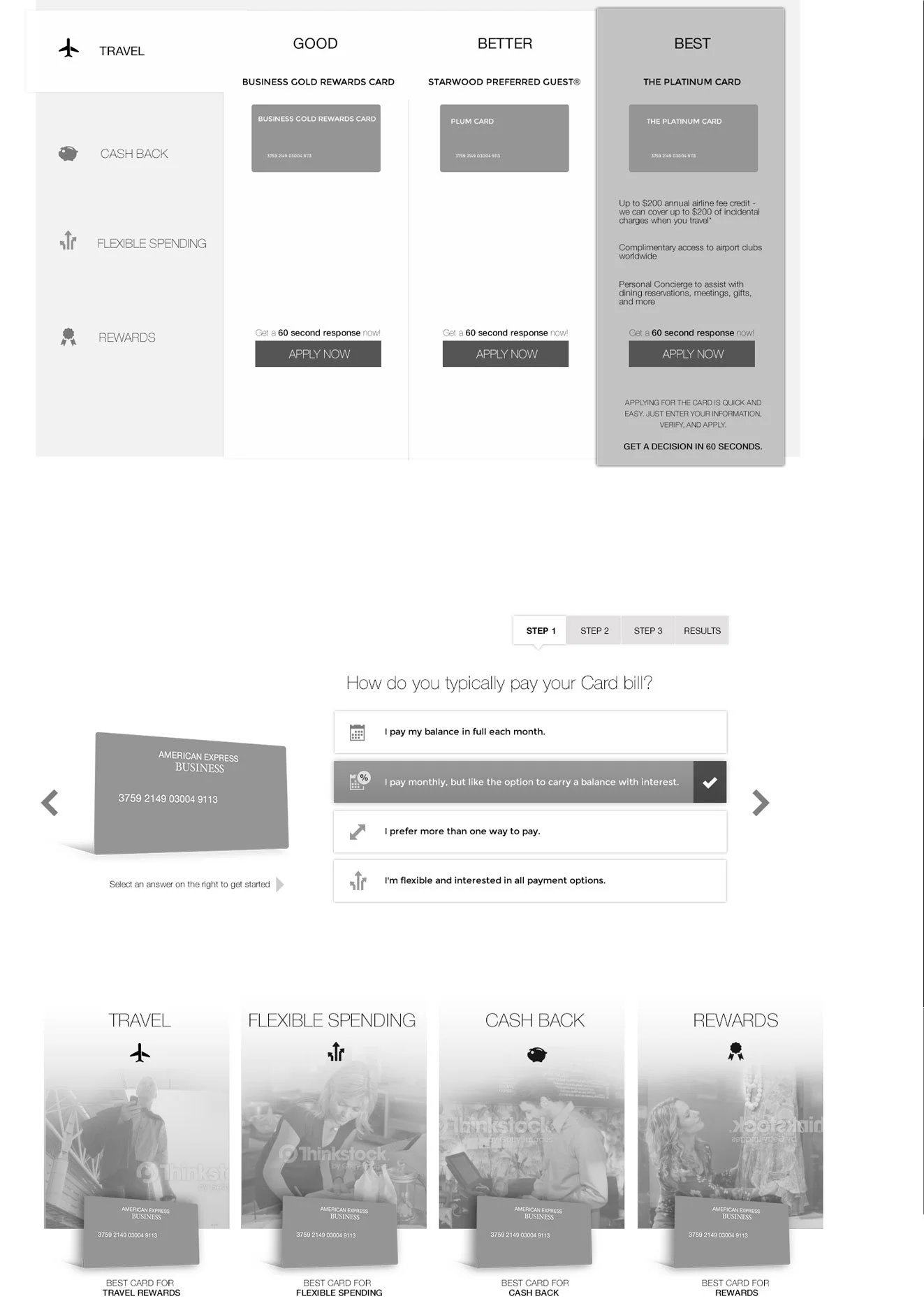
Testing & Validation - Both moderated and unmoderated user testing proved our optimized design a success. There was a ~32% increase in users leaving the experience with enough understanding to have a “meaningful” final sales call or to begin an application process online. Moreover, we had the positive side-effect of about 12% of users not even needing to make the sales call, huge cost reduction. Users identified their card and went straight to the application process, thereby solving one of the stated business goals of reducing call volume & time, and higher approval rates.
Final Design
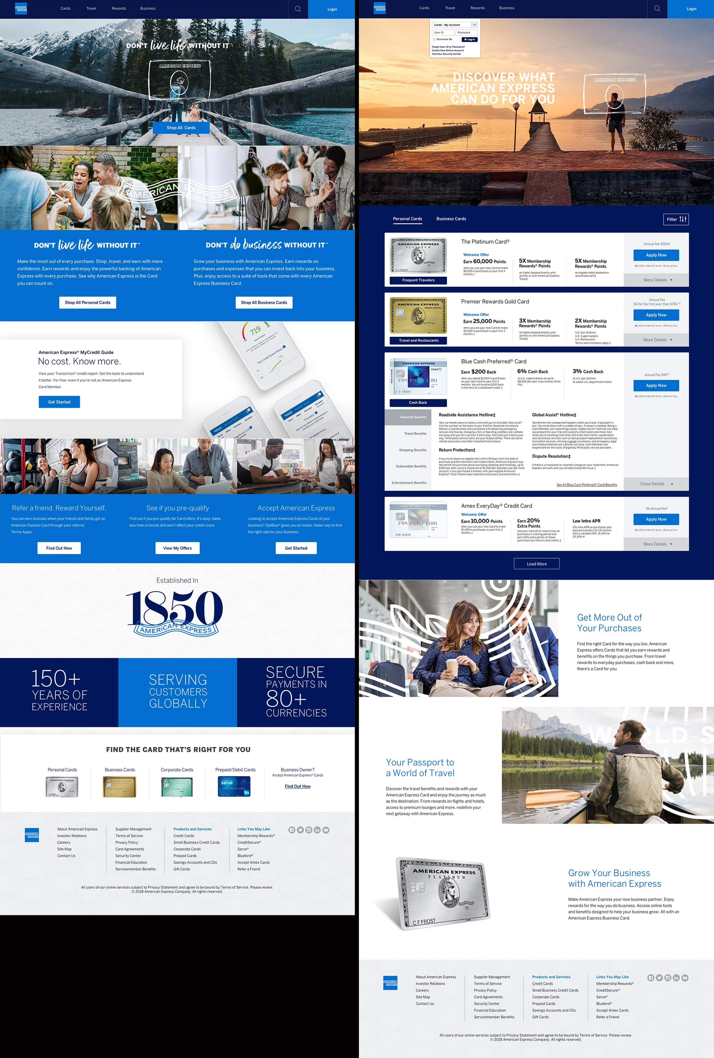
AMEX Rebrand Model - As mentioned previously, the example below was a pure translation of the AMEX rebrand guidelines. Heavy focus on marketing content, 3 gateways to different business units who compete for homepage real estate, and very thin in terms of calls-to-action or clear user guidance about the products they offer. Our testing showed this experience to fall short across all metrics significantly.
Our Model - This was the final compromise to keep the branded hero theme intact while also giving users quick, digestible and actionable items to interact with. We surfaced the top 3 benefits for each card, we surfaced 3 or 4 cards based on user data (data science input), and everything was consumable on one page. A secondary iteration gave the user the ability to launch a wizard that asked them qualifying questions to narrow their decision and lead them to the right card for them.
Targeted Experience Design
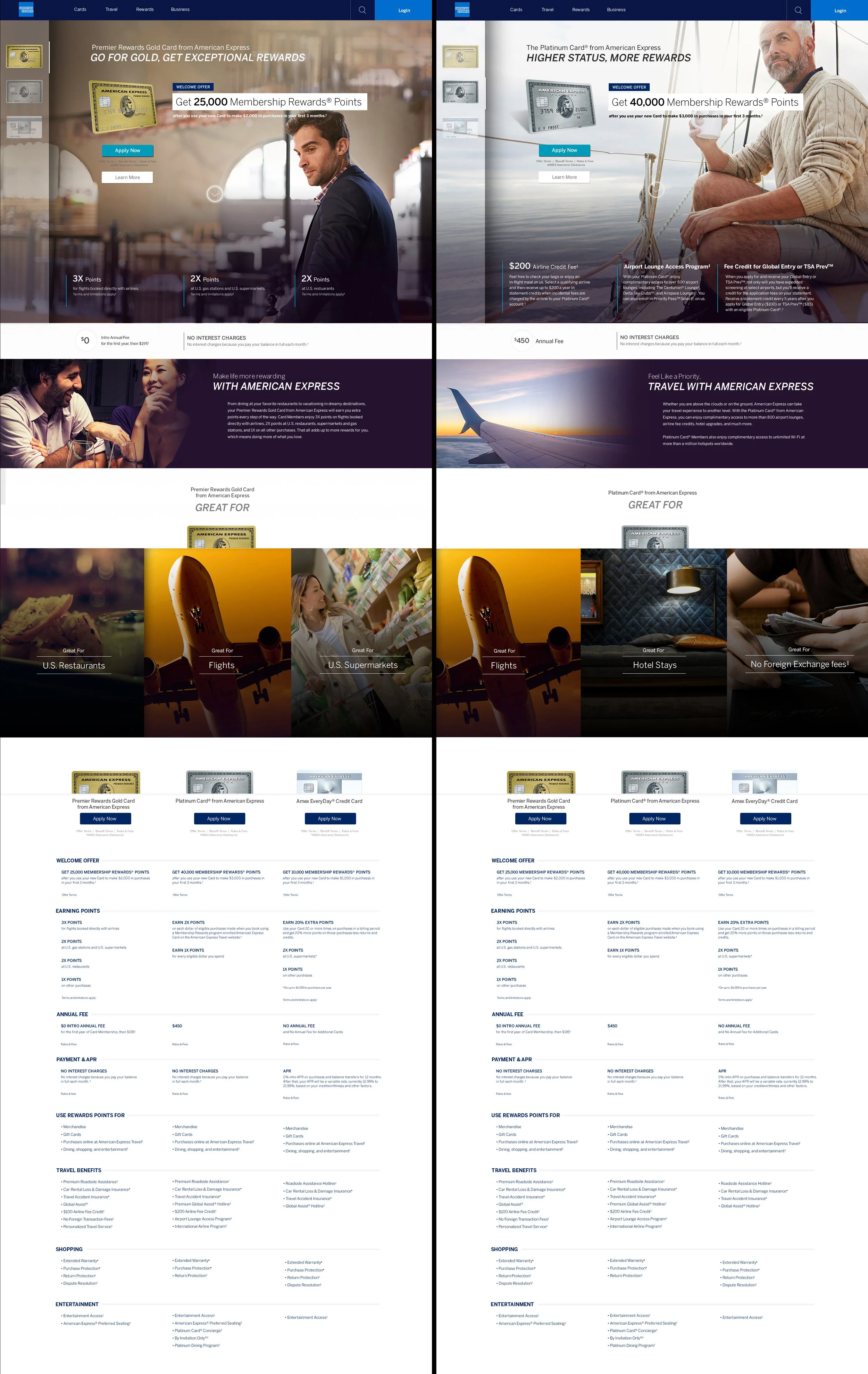
Hybrid Model - This was a 3rd generation blend of both models after user feedback, AMEX internal feedback, and a test to see how we might merge their vision and our vision. We maintained the emphasis on imagery, while surfacing the content we found successful. Data results were flat on all metrics so we made the final decision to move ahead with this model.
Cobranded Experience
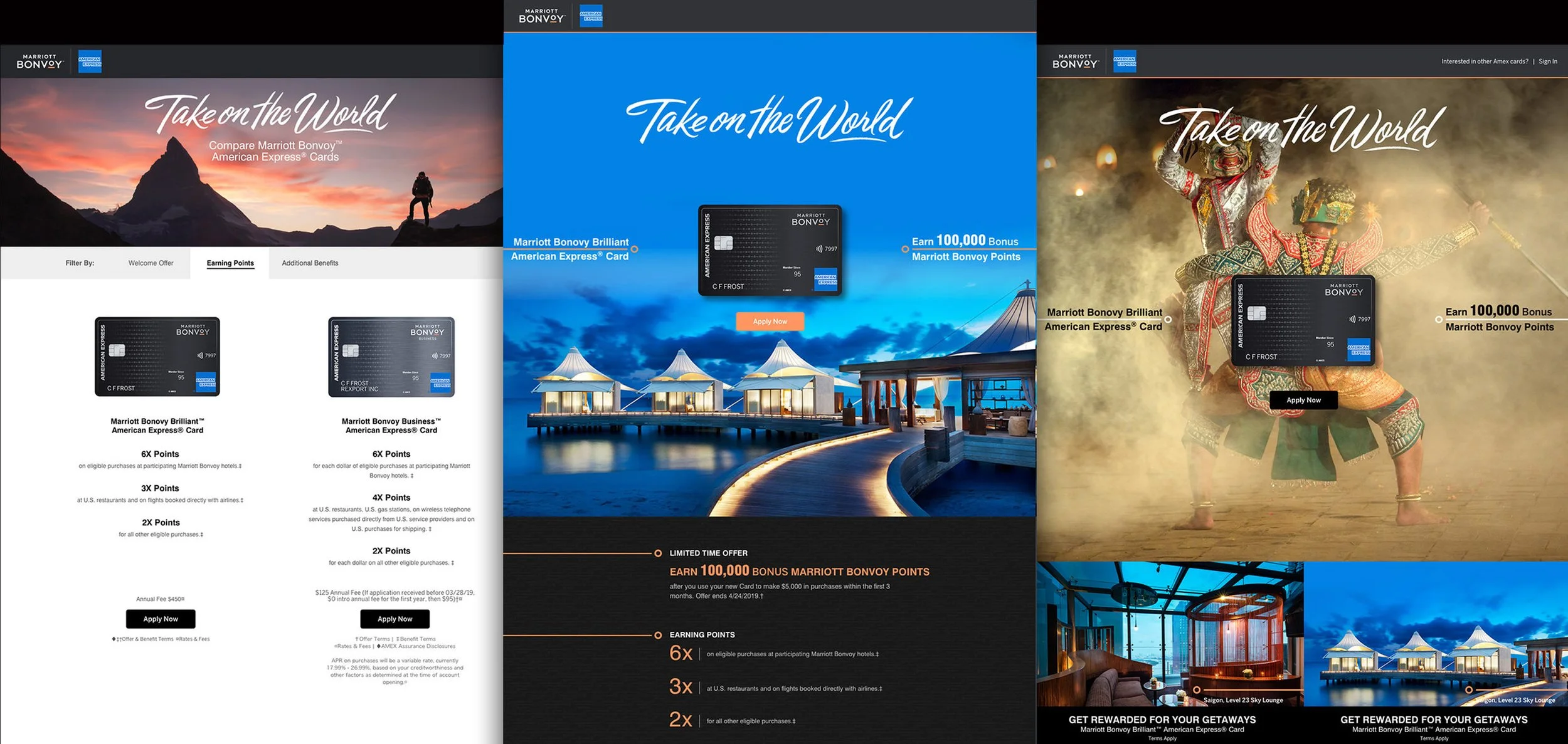
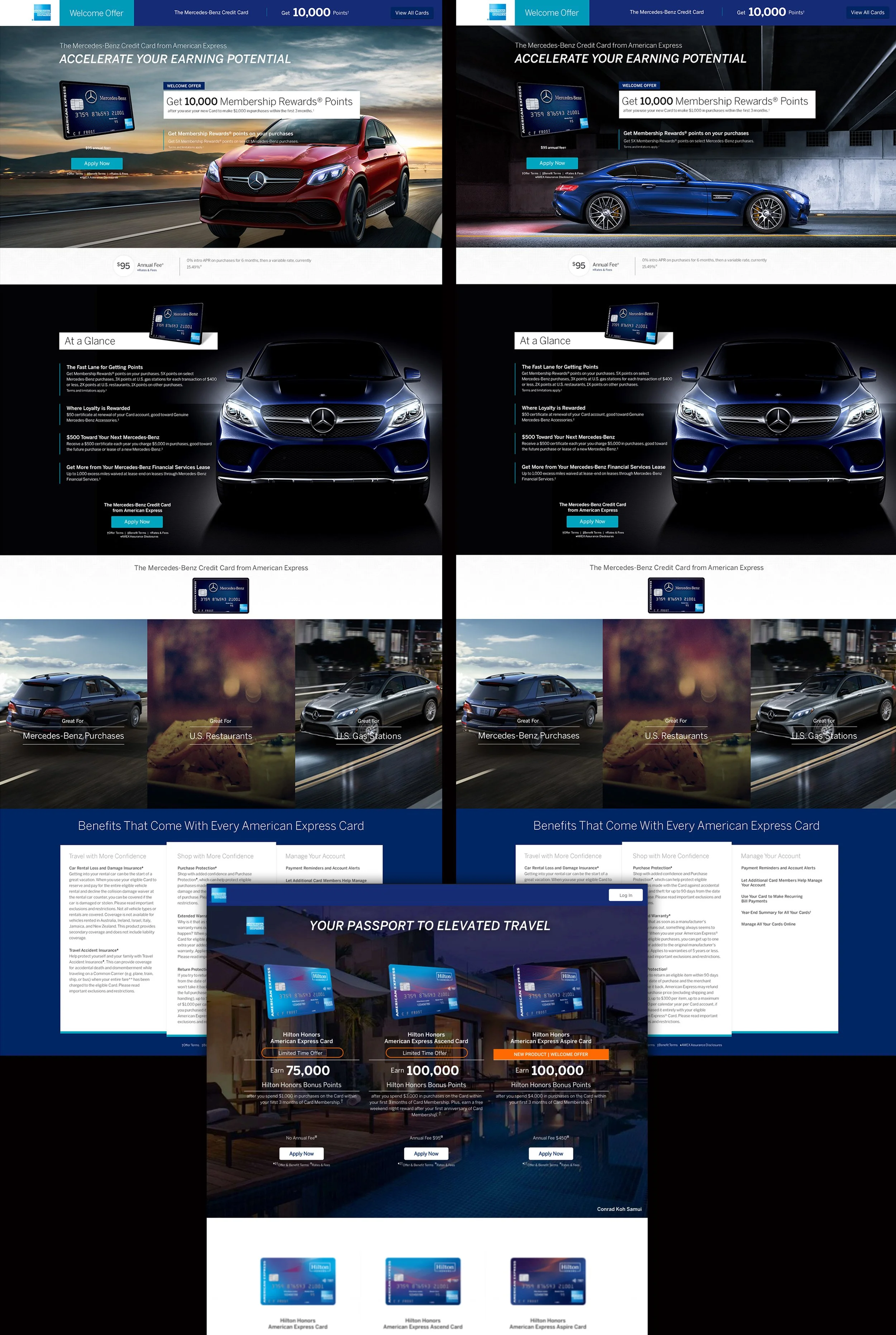
Alternative Solution & Results - American Express partners with other large brands to provide card membership to loyal customers. As mentioned in my overview, one of my primary roles was to identify all the different demographics, traffic splitting, and feed different imagery and content into the experience as the user enters. Because cobranded users are highly motivated and come in with a clear intent, we were able to make this design decision based on the hybrid model. These Marriot and Mercedes experiences had our highest conversion and approval rates of any card.